How did we do web development for a Cyber Security Company?

We had the opportunity to do web design and web development for a Cyber Security and Identity Access Management Company. Once we started the project we were also tasked to do the branding for this B2B brand. We came up with a new meaningful brand identity/logo and visual language for the brand. We used stylescapes to detail out the visual language.
B2B websites doesn’t have to be boring – and we made sure of that in this B2B web design.
Brand Imagery for the Web Design
One challenge B2B brands face when we design their websites is to get their imagery right. Usage of stock images always make the website boring. So we came up with a unique visual style and vector illustrations to give the website communication an appealing look. We also used lottie animations to make the web development interesting.
Why we used Lottie Animation on this B2B Web Design?
Motion design (also known as motion graphics) is a subset of animation that involves animated graphic design elements. With the help of Lottie animations we were able to evoke an emotion on the website which made it appealing. It helps to grab the website visitor’s attention to a certain section. With the help of motion graphics we increased the engagement. The more users engage, the more likely they are to convert. Engaged users spend more time on the website and it helps in SEO as well. Motion design helped us to build a story and helped with the website’s overall storytelling.
Navigation on this B2B Web Design
Navigation was a key element on this website since the brand had many solutions to offer. We made a mega menu for the solutions and for the technology pages we added brand logos to make the user experience smooth. The best kind of navigation design is one which promotes usability. Mega menu on B2B websites can give users a great experience.
How did we do web development for a Cross Border Trade B2B Company?

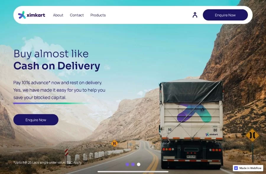
When XIMKART approached us for a new logo design and website design for its B2B brand it was the first time we were about to work with a cross border trade company.
Content Writing for B2B Website
Once we did the branding and website strategy, the next step was to get the content and headings for the website written. We started with the information architecture for the website based on the sitemap. We made sure the home page tell the overall brand story and will act as a gateway to the other pages. Illustrations were used in the web design to explain the steps involved in the buyer’s journey.
Webflow Web Development
Webflow helped to reduce the overall development time and web design elements like sticky elements where used to make the overall website communication great.
Web design and Web development for Sports Management B2B Company


