How To Employ Illustrations On B2B Website To Boost Marketing?
Illustrations elevate brand identity and engagement, exemplified by brands like Headspace, Spikenow, Notion, Dunzo, and Frooti, each utilizing unique visuals to convey their messages effectively.

Illustration in Brand Building and Website Design
Visual imagery in the form of various graphics helps retain the interest of consumers and often provides relief that breaks the monotony. Illustration is one such trend that is explored by many brands as their visual language. This can lend to brands having an unique identity like the Amul girl who has become synonymous with the brands identity or as simple as Google's minimal illustrations that provide a very human touch to the search engine platform. Illustration not only adds visual aesthetic to your design/product/service, it can also be effective in increasing brand awareness and recognition. Visual content can be engaging and when it comes to viewing products as well. Whether the concept be simple or complicated both can be easily shown through images. Illustrations as a visual language of a brand can set one apart or even blend into the crowd based on how they are used and envisioned. Let us look at some examples of brands that have illustrations as their primary visual language.
A brand is a promise. This article outlines how illustrations are being used to express brand value and how businesses are investing substantial time and resources into extensive brand illustration systems.
How Headspace is using illustration in their branding?
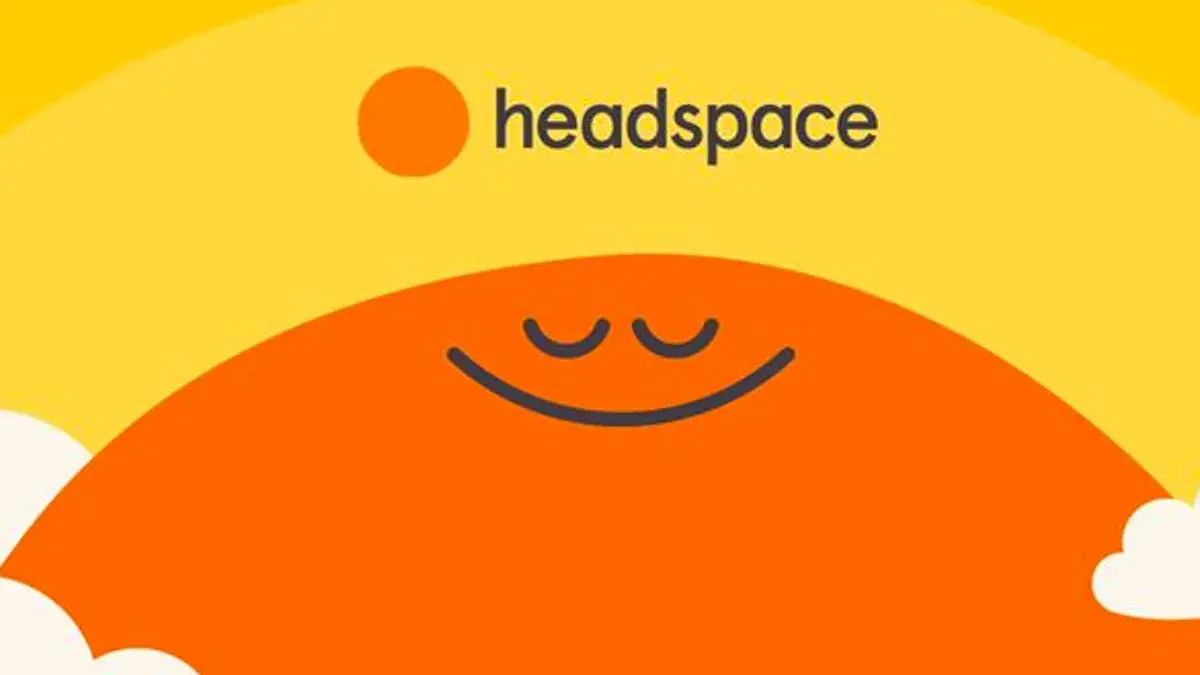
What is Headspace?
Headspace is a service based mindfulness app that focuses on meditation and mental health. Their aim is to improve the health and happiness of the world.
Why do we like Headspace Illustrations?
Headspace employs a more quirky and joyous approach to its branding giving the brand the perfect opportunity to create beautiful illustrations that go with what the brand has to say. The illustrations have a light airy feel that bring forth the idea of mindfulness. They explore this through the rounded edges, playful and vivid colours and the minimalist nature of the layouts. Who knew simple shapes could bring forth so much joy to help create goals for healthy habit formation.

The illustrations are dynamic in nature, easily situated in multiple scenarios that help encourage positive growth. They are calming to look at and make the consumer feel safe and secure in relation to sensitive subjects like mental health.
Expanding Headspace Illustration Style
The illustration style used is a flat illustration style with a bright colour palette, Prominently yellow and orange. These illustrations for headspace are highly customized.
The circle shape is used consistently throughout all the illustrations on the website with a smiley face that is distinct to the brand. The experience they are trying to emulate is living a life with a healthy mindset and being able to take some time out for yourself whenever needed. They set themselves apart through their unique style that helps a user visualize how it is ok to feel overwhelmed sometimes and there are ways in which you can address those issues.
Why do the illustrations work on headspace branding?
Headspace has a more young energetic approach leaning towards a younger audience who would novicess in such areas to engage with it. At the same time headspace does happen to be for everyone including people who have experience. They focus on creating visualization that would cater to their primary target audience, Young people from ages of 12 -25-year-olds. A younger, less experienced audience is able to feel relaxed even though some topics may be very intimidating and personal.
It works with their website flow because they are keeping a consistent style and colour palette with typography that matches the brands visual as well.

How Spikenow is using illustrations on their web design?

What is Spikenow?
Spikenow is a productivity tool that allows you to seamlessly collaborate, create audio/video meetings, manage projects, edit docs and more to get work done. It is a powerful tool that revolutionizes your email inbox and transforms your existing email into chat.
Why do we like Spikenow Illustrations?
The illustration is a mix of flat illustration style that has a high level of creativity and personality. The customisation makes it stand apart from the crowd. It mixes in 3D form of the cards to give some dearth and perspective. The texture used on the illustration is a grainy texture that gives a sort of old and worn out look.
Expanding Spikenow Illustration Style
The visual language is far less successful as it combines too many layers, focusing on being unique rather than combining strong copy with easy to engage imagery. A more robust visualization does not help build trust. It strikes as too complicated for the target audience, people employing Project management softwares like businesses.
Their website relies heavily on the Illustrations to break to monotony as the layouts and colours are repetitive. The complexity of the design does not make it flexible to adapt for mobile screens.
Why do the illustrations work on web design?
Spike now is technology based software and can use illustration to its advantage to convey how the user can integrate it into their current workflow. They have used illustrations to show each of their services and how they will make a difference in your daily work. Although the illustrations itself are unique they do not suggest the aim of the brand immediately. The website's language has a feminine approach which adds a calming quality and appeals to industries with more creative outlooks. The problem solving of the company is a creative approach.
Notion uses illustrations extensively on their communication design

What is Notion?
Notion is a note taking and project management software. Their mission-vision is One workspace. Every team.
Why do we like Notion Illustrations?
Notion at first instance can be complex to understand as it is aimed at everyone and anyone who requires to organise their documents and projects. To give a topic such as file management a human touch, minimal illustrations have been employed around the software. The illustrations help navigate the website easily by being the explanation for pointers themselves. It provides a relief from the sometimes overwhelming vocabulary/information given.

Expanding Notion Illustration Style
The audience is Writers, graphic designers, other creatives and marketers and small organisations who would be required to manage their documents.
It is important for the audience to resonate with the illustration . The Notion illustrations convey that the product makes your daily tasks easier to keep track of and is easy to utilise, no matter where you are
The illustration style is flat illustration style with a modern and clean look to it. There is a sort of texture created with circles that has been incorporated into the design. Although the imagery/icons that are used are somewhat already seen before, the illustration style itself has made it look more unique. The experience they want to show is that the product is a one-stop solution for all your needs to keep track of and organise your tasks across various platforms and people. They have used a clean black and white colour on the website that does not distract the viewer.
Why do the illustrations work in communication design?
The illustrations have a stock quality to them as they easily exist in various other forms on numerous websites that use this flat-line style of illustration. This does not take away from the website and still, they keep a consistent style and colour palette with typography that matches the brand visual as well, they would like to highlight the tools one can employ to keep their files organised and the clean illustration style helps the layout breathe without cluttering it.
Dunzo is another brand which uses illustration on their branding

What is Dunzo?
Dunzo is an app that connects you to the nearest delivery partner who can make purchases, pick up items from any store or restaurant in the city and bring them to you. Dunzos' mission highlights how people can change the way they move things, how they shop and lets you access your city like never before.

Why do we like Dunzo Illustrations?
They have used illustrations to show how simple it is to get items delivered to your doorstep. It reinforces the fact that Dunzo can make your life easy and save you a lot of time on tasks you would have needed to do yourself. Dunzo has created its own clay-style illustration.
Dunzo has used both flat illustrations and 3D illustrations. Prominently in the black and green colours of the brand. They have used texture and patterns very minimally in their illustrations. The illustrations themselves are seen before and very common, a delivery guy picking up stuff. However, they have made the illustration very up-to-date. If you look closely you can see him wearing a mask in all of them.


This reflects the Covid pandemic that has hit the world. Furthermore, this shows that the brand prioritises the safety of its team and its customers. They want their customers to view Dunzo as part of their daily routine. “Oh, I don’t have paneer? Let’s Dunzo it”, “I need to send a parcel. Let’s Dunzo it”, “I don’t want to cook today. Let’s order something from Dunzo”. According to the medium*, Dunzo has revealed the secret sauce was to let the illustrations be approached with an Indianness, without the characters being whitewashed adding a sense of relatability. That is the experience they want to leave with their customers. How easy it is to get things delivered to your doorstep; hassle-free. Anytime, anywhere. The waiting time for a consumer during deliveries allows the Dunzo team to put forth a quirky storyline and messages that can keep the audience engaged. The Dunzo verse helps highlight various stakeholders and their unique quirks.
Expanding Dunzo Illustration Style
The illustrations show a delivery figure picking up groceries and essentials, fresh fruit and vegetables. Receiving and dropping parcels and getting food from restaurants. It shows how everything you need is at the tips of your fingers, how someone else can do this all for you and that you can essentially do all of this without having to leave your home.

Why do illustrations work for Dunzo?
Helps provide creative relief to the app and adds to the flow and convenience of understanding the products and services they offer. The illustrations are unique to Dunzo and easily add brand recall with the visual language.

Frooti - Illustrations

What is Frooti?
Frooti is branded as a fresh mango drink made with real mango pulp, and no added preservatives. An easy-to-grab-and-go carton filled with delicious fruit juice that you can enjoy from anywhere.
Why do we like Frooti Illustrations?
Frooti has been on the market for a long time. Like many beverages, it has evolved. Over the years through it they have used illustrations to showcase the way that still would like to channel the feelings of childhood. A sort of fun and carefree feeling you experience when you drink Frooti. Creating a Frooti world where Frooti takes centre stage around claymated environments.
They have used a 3D illustration style with a realistic look to them, as well as using a varied colour palette. The illustrations have been customised for the brand. The illustrations on the web supine are also interactive where the user watches a video by clicking on it or they can engage and play games. The audience is everyone who enjoys a fruity beverage and appeals to a wide range of audiences to keep their inner child alive with the juice box that is primarily for kids.

Expanding Frooti Illustration Style
The illustrations are used in the ad campaigns for Frooti and stand out from the crowd as they truly have a creative perspective and let’s. Imagination and childhood come out in a more quirky approach setting it apart from its competitors- like maaza catering to a mature audience and Paper Boat whose nostalgia and eco-friendly packaging to give it a premium feel.
Do the illustrations work when used in branding?
It is important to be a brand in a market that stays relevant and frooti tries to approach the same old message with a revamped look that gives it a more modern approach that can bring back Fuchs by not fading into the back of a shelf. Each illustration has so much movement as even though it is attic it has movement with the tiny scenes created which is difficult to achieve in illustrations.

Conclusion
Illustration as shown above can be employed for various purposes right from building emotional connect to stock imagery that are employed just to provide relief. Not every brand requires illustration and it would be imperative to assess what specific kind of imagery and graphics will add value to a brand without wastefully employing them. Having a smart approach can prove the brand's resourcefulness showing how they are clear in their messaging and identity creating more trust and engagement with their audiences.
