Crisp communication is very important in website design and development. Your website should do brand communication and product communication. Strong website design is the path to a great user experience (UX) and improved time-on-page, conversions, and search engine rankings. To convert website users into paying customers, you need to know who they are and what they want.
How to achieve crisp communication in website design?
People like to put brands into a box and you should let them, that is why positioning and website communication is very important. You should start with the category you want to be considered in. Above the fold should clearly define who you are and who you are for, the ICP?
Generic statements and claiming many things will only confuse people. Rotating text value propositions and headlines are never a good idea for a website. That is one of the common mistakes website design companies make.
Once you clearly define what it is you do and who it is for, you need to lead the website visitor with use cases. Your website should communicate what problems you solve for the ICP.
The Bezos Blueprint: Communication Secrets of the World’s Greatest Salesman
Whether you’re writing an article, document or email, says Mr. Gallo, you have 15 seconds—the time it takes to read 35 words—to grab a reader’s attention. After that, 45% of readers will stop paying close attention.
And we all know website is your salesman. Websites play a central role in the customer acquisition process. A brand’s website engages more prospects on a daily basis than a sales team possibly could. Learn to think about your website as your 24/7 sales person. It can help to answer questions your customers have.
Examples of websites with crisp communication done by website design companies
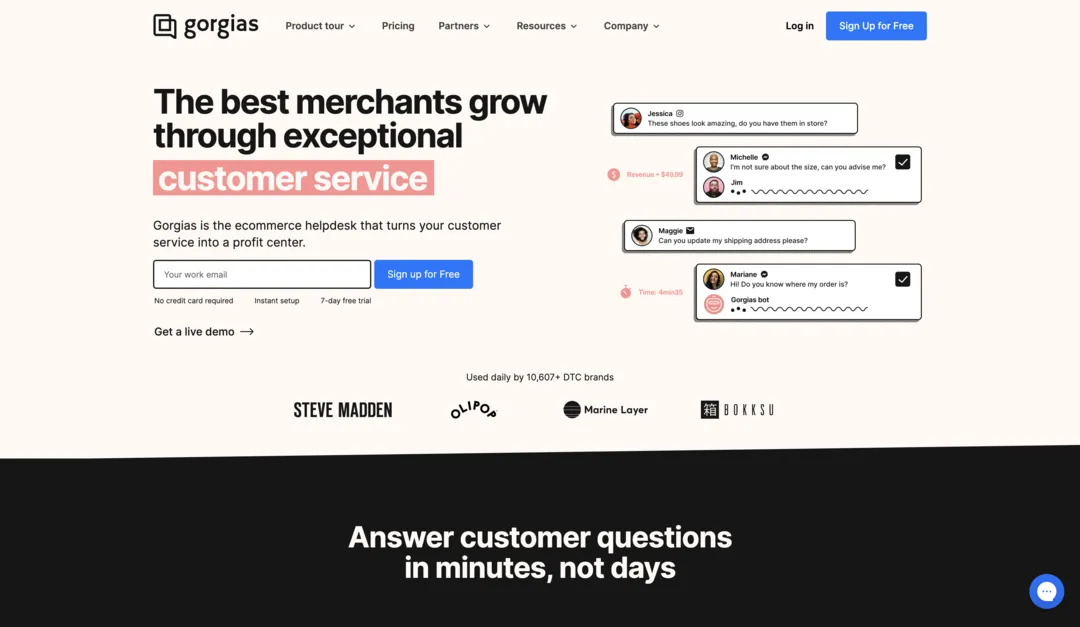
Gorgias’s website design
If you look at Gorgias’s website from the website headline and supporting copy the product communication is very clear. It is clear that the product is meant to e-commerce brands for customer service. They are also addressing the concerns and barriers at the very beginning of the website.
Many people don’t want to give credit card information to try the product, people are also concerned about the setup complexity and most customers want to try a product before they purchase it. Gorgias is addressing this by communicating -No credit card required – Instant setup – 7-day free trial.
The next thing is social proof, the brand logos and the number of clients they already have tell a potential customer that they can be trusted.
Followed by them, the website is clearly communicating the brand promise – Answer customer questions in minutes, not days.

Home Page Structure of a Website Design
First fold of the website
We already discussed how crisp the communication, copywriting and design is on the first fold. Any potential customer can clearly understand what is the value proposition, who is it for, and what category is it for? The first fold is getting concluded with a brand promise – which will make a website visitor scroll down.
Second fold of the website design
Next thing the website is doing is clearly communicating the key three features with a call to action – Get a Live Demo. We can see the visual language is consistent and with every feature the heading is clear with supporting content and dashboard imagery.
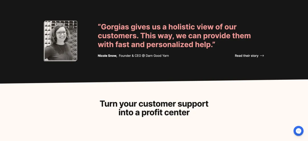
Testimonial section on the website

The testimonial is also very crisp and the font size they are using clearly states that they are not shying away. Here also the call to action is helping a website visitor to know more about the use case. The website is using the testimonial to sell the benefit, painting a future state for a potential customer. The use of imagery along with name and title is also supporting the website communication.
Website Communication – Sell the benefits
Once you have made certain promises and painted the picture, now it’s time to make an even bigger promise. In this case customer support is the product and in a typical scenario customer scenario is a cost center, now turning that around and saying turn the customer support into a profit center is going to hook any potential customer.
Once the product promise is made, now it’s time to show how it is done. What is the process?
Ending the section with another testimonial which supports the product promise is only making the website communication better.
Addressing potential concerns in website design
Every potential customer has concerns, the earlier you address those, the better your sales process is going to be. It is important to address the concerns and FAQs on the website.
What does a good website design look like?
For someone who’s never seen your brand or product, you have to help them understand:
– What are you selling?
– Why are you selling it?
– Why are you the best option to purchase?
– How will it make my life better?
– How quickly can I get it?
A good landing page doesn’t just focus on aggressive sales.
Instead, do the best job educating someone on why they should make a purchase.
The best customers are those who buy into the mission of the company, not the ones who get tricked by some promo or offer.
What is Information Architecture of a Website?
I like to follow what I call the “Pull & Pull Method”
You PUSH with education.
You PULL with a CTA to purchase.
The key is to have a good balance of educating and selling.
Think about what your ICP would want to hear in order to buy something! Design the page to the traffic source & intent.
- A clear story
- Compelling copywriting
- A design language which works with the copywriting
Don’t tell your audience who you are. Show them and let them develop those feelings themselves. That’s how you build a real brand reputation.
We Design & Build B2B Websites with Webflow which gives your business conversions. We relay on both on persuasive copywriting and design to achieve this. Webflow agency based in Bangalore with a solid foundation on brand design, website design and development and coding.


