
Like all website developers, webflow developers develop websites very quickly and effectively. But currently, webflow has some restrictions which need to be addressed to the designer so they design a website that can be quickly developed and does not cause a designer’s nightmare of not seeing their actual designed website.
Designers and Developers go hand in hand?
As far as I know, Designers and Developers do not always go hand in hand and there can be many reasons, I will be addressing a few of them today which can help designers and developers to complete their websites easily and before the deadline so they can enjoy their coffee.
Now, let’s see what a designer must know when they brief a webflow developer.
5 Briefs to give your webflow developer
1. Style Guide
For a webflow developer making a proper Style Guide is important so they can neglect additional classes which can make the website heavy.
A proper Style Guide not only consists of a Font family and Color palette. There are other things that can help developers work very efficiently. Following is the list of things that should be present in the Style Guide
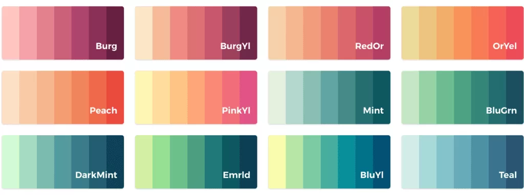
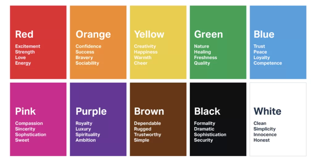
- Color Palette*
- Font Families*

- Font Colors*
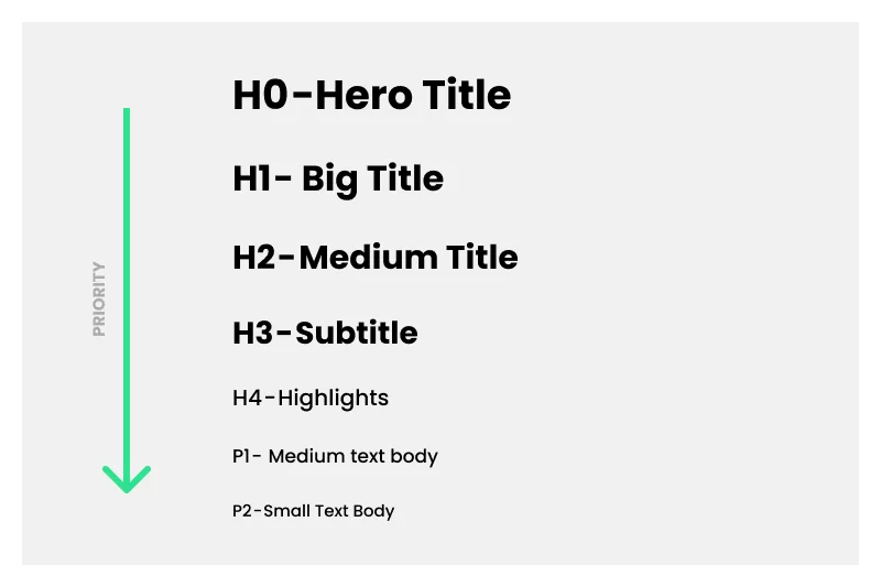
- Heading (H1 to H6)*
- Font size*

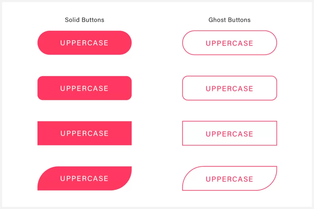
- Buttons (CTA, Ghost Button)*
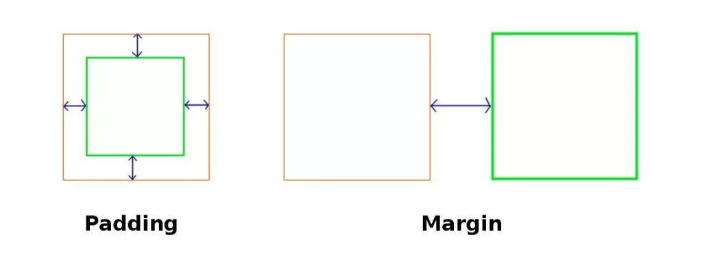
- Container and Section (Margin and Padding values)*
This is not that compulsory as the developer can take the calculations from the design but can help to have pre-made classes in the style guide.
2. Assets
You are considering having a design with beautiful photos and illustrations but, when the development happens the quality of the image drops drastically, and before you start cursing the developer, note that a website is supposed to be up to 200KB photo size. So when the developer begins developing they have to eventually reduce the size and you are left with a bad image.
To avoid all this, the following are the basic steps that can help you.
- For the pictures which you what to use, you need to make sure they have less resolution according to design (e.g. If you are having an image for a small section with a width of 540px but the resolution of the image is 1920*1080px, so the images will have a higher file size which is not required)
- If using Illustrator or Photoshop try to export with a lower resolution.
This is just an example, of how lowering the resolution reduces the size and helps with the website performance.
Illustration icons give very good appeal and have easy ways to convey a message.
But, if you look closely you can see the bottom alignment of icons which is not in a straight line. This can be a reason for adding a class to the code which in my opinion can be easily avoided with a simple trick. Following is the procedure on how to avoid this and still give the developer an easy time developing the same alignments.
- Check for the maximum height and width by comparing all the icons.
- Make a rectangle of that width and height and align it on icons according to the design requirement.
- Then mask the icon with the rectangle, This will allow all the icons to have the same size and for the developer, it will be easy to export and use single for alignment and sizing.
Section overflow images are scary assets for a developer because in a few cases a section might require overflow-off to make sure the page doesn’t get the horizontal scroll.
To avoid this, we can have a design that does not have many sections overflowing items, and to be fair, I know most designs look good with elements overflowing through sections, but this might cause a bad horizontal scroll.
3. Section and Container
A section is the parent of the container which goes all the way to your screen-size width or height (depending upon values).
A container is a block that helps to contain all the assets and content you view on screen. This provides the blank on the left and right and restricts the content to go beyond the container.
In a website design if you have symmetricity for sections and containers this will allow you to avoid extra bits of code and also development time. Having a few sections and containers is very useful.
4. Forms
All websites have a form (Contact Us, Newsletter, etc.)
When a person submits a form, they need to get a message stating information about what is going to happen after form submission or a general thank you.
This is an important component present in the design which can go with the design instead of some old and ugly form submission message.
If you have a form on some other page instead of a homepage like a separate contact us page or inquiry page, you can have a homepage button that will redirect the user back to the homepage. This is a UX thing but very useful if you want the user to stay long on the website.

5. Mobile Adaptation
You might have a section where you want to have a sticky element for the desktop that looks great but for mobile may not work. In this case, you have to go with simple static content and you might think the developer might handle this but when you see the website it might not be what you would have expected. To avoid all this the best solution is to have a mobile responsive design.
Having a mobile adaptation is very useful from a development perspective. But, many designers have a question of what is the best screen size for mobile adaptation design. In my recommendation go for 375px. This will give a good idea for 320px up to 479px width screen size.
Final Verdict
Designers and Website Developers still have many arguments which can be traced back to ancient history and I think it will go on for god knows how long but maybe a few suggestions and tips like this help people overcome this long list of arguments.
What can you do for effective collaboration between designers and developers?
➡️ Understand your team’s tech stacks, learn its limitations, and talk to them about opportunities to explore beyond.
➡️ Plan development challenges ahead when designing the solution. This will save time for both the design and tech teams.
➡️ Communicating your designs to developers effectively is the key strategy for a smooth handoff.
➡️ Try covering solutions to as much as edge cases possible for all the scenarios.
➡️ A prototype is a great way to feel the solution we deliver.
➡️ Try explaining your solutions through animations, videos, prototypes or even a reference if you could find it online. This way, it is easier for the tech team to understand the interaction.
➡️ Always do a design QA during the development phase and ensure the bugs are fixed before release.
As designers, let’s take complete responsibility for delivering quality results – Naseer Ahmed.
Additional Reading – Designer – Developer Collaboration
- 5 Principles for Better Designer-Developer Collaboration
- Designer-Developer Collaboration Sucks. Here’s How to Fix It.
- Design Talks: Better Designer and Developer Collaboration with Aarron Walter of InVision
- Four Effective Ways To Improve Designer-Developer Collaboration
- 5 ideas for better developer-designer collaboration
- Making It Easier for a Designer and Developer to Collaborate on Projects
- 9 ways to improve collaboration between developers and designers
- Tips For Improving Designer-Developer Collaboration


